Our room in this year’s show house is the main
bathroom. It is located on the second floor and will be shared by the
women of the home.
At 8’-0” x 12’-0”, this space had a lot demanded
of it, it needed to: accommodate Stephanie and her three daughters (quite possibly
all at the same time); provide adequate storage for all of the things we women
require to make ourselves presentable; provide open spaces for display & plenty
of storage; and if possible, include a bathtub. This is the space as it was
when we started… an empty space that had already been gutted.
We set to work and, after several revisions, this
is the floor plan and elevations we presented…
And this is the final result...
[photograph borrowed from the showhouse program]
Now to backtrack a little, here’s a breakdown
of the design process. It all started when I toured the home for the first time
and walked through the beautiful leaded glass entry door.
I instantly thought of this fabric: Fioretto
in the colourway Sprout. (Yes, I have a fabric catalog in my head and frequently
refer to it…welcome to my world!)
On each and every project, we search for an
element that can be subtly altered and repeated throughout the space. This
brings a sense of comfort in the cohesiveness, even if the occupant doesn’t pick-up
on the details or understand why. On this project, it was the blending of the organic,
undulating line contrasting the sharp geometric angles found in the leaded
glass pattern. This contrast was repeated throughout the room and presents itself in
the tub splash…
the marble backsplash…
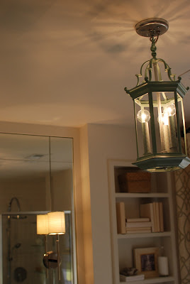
and the vintage lantern, which was found, in it’s original brass finish, at Juliana Daniel Antiques. (did you notice it’s also hexagonal?)
We spray painted it celadon and silver and the
Kaarskoker candle sleeves just happened
to be an exact match. (I really love it when that happens by accident.)
We like to mix unexpected textures and styles
together as it gives a room its own unique character. Here we contrasted to the
traditional American secretary, with a carved African stool. (please forgive the missing hardware… they’re resting safely in the drawers.)
One of the Boyle’s favorite features of the
bathroom is the trough sink with dual faucets. We love the contrasting textures
of the honed carrara marble and the polished chrome fittings.
Lastly, the bookshelves above the tub have a hidden secret… the bottom shelf is wired and sized for a small flat-screen television for long baths while watching Pride and Prejudice…
Calgon take me away!
For those of you who are still reading, THANK YOU!!!
BTW, all photos not credited were taken by my
exceptionally talented sister-in-law, Stevie Cowgill, who is currently starting
her own photography studio. You can be sure I’ll keep you posted!


No comments:
Post a Comment